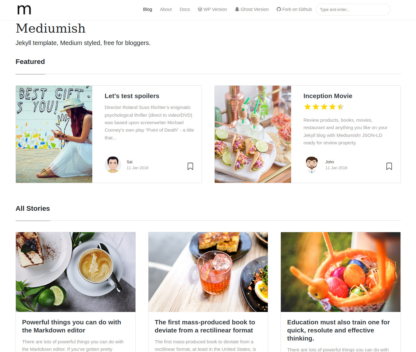
In this topic we collect interesting Jekyll themes that can be the starting point for the redesigned HTC website.
Hi there, dear Community!
This is a poll to ask for your preference for the new humanetech.community site design. And I am going to influence you a little bit here, as I think the that Mundana is best suited, and also looks quite appealing 
But if there’s overwhelming  preference for one of the other themes above, then I’ll certainly consider choosing that. If you have other preferences, then please also consider adding a comment below with your reasoning for the choice.
Note that the templates are just the starter, and we will further tweak and improve the design to make it HTC-ready. We already have volunteers to do the programming (yours truly) and UX design (@eclein). If you also want to offer your help, then please do so by editing the wiki in Help Redesign HTC Website for Humanetech Translation Program. We’ll attribute you as contributor, and you can practice some new skills.
Which site theme do you prefer most?
- Mundana
- Jasper2
- Mediumish
- Feeling Responsive
- Affiliates
- Jekflix
0 voters
A particular shout out of thanks to the volunteers who have already joined the translation program!
@AB9, translator to Greek, 
@abuikis, translator to Russian and Italian, 

@albertosgnovo, translator to Spanish, 
@aschrijver, translator to Dutch, 
@ceceline, translator to German, 
@chalgo, translator to Korean, 
@chauanhvu1512005, translator to Vietnamese, 
@emiliobfreire, translator to Brazilian Portuguese, 
@KateSh, translator to Ukrainian, 
@lopeztel, translator to Mexican Spanish, 
@lamacri, translator to Italian, 
@Saiyu, translator to Chinese, 
@vald_es, translator to Spanish, 
@ybcl, translator to Spanish, 
For you this poll will be very interesting, as it is about the look & feel of the site that will showcase your work.
So vote, vote, vote 
Wow! The votes stream in like crazy 
Hi @eclein, what is your preference. Note that the template forms the basis of further UX design. We haven’t specified UX requirements in depth all that much. This choice is mostly about overall look&feel (which we’ll adapt as well) and an inkling of information model/navigation (like having highlighting ‘featured’ / popular posts, magazine vs. portfolio layout, etc.)
Alright people, I have closed the poll. Mundana has been chosen as the theme to use! Second in line was Jekflix, which is also a beautiful theme. The reason why I favored for Mundana were its additional navigation options (featured articles, tags + categories, popular list), and also the Jekflix theme with its black design is more fitting with problem awareness activism than with the solution-orientation along which the HTC aligns (which is most fitting with a brighter, more optimistic look&feel).


