Hello all!
Recently I’ve been seeing a lot of people being confused about the difference between HTC and CHT. I think a good way to help correct this would be to have a new logo that is not so similar to CHTs, maybe on that incorporates the pyramids of humane tech that we developed together. I talked with David Jay and he said we could go for it BUT this is up to the community as a whole. What do you guys think?
I have an idea and don’t care for ego credits or whatever if someone else wants to draw the same thing thats cool I have not started drawing it:
It’s a flat screen like a TV on a wall, but there is a live dude smushed up behind the glass all contorted inside like I just wanted to watch the TV not have it grip my whole body inside of itself haha. I was thinking of visually a square logo with the screen in the center and the dude either with his body being encased by the screen like quicksand or he’s already boxed in it like a frog in a jar.
Hi Siddhi,
The likeness of the two logo’s is intentional. That is because there is still a strong affiliation between the community and the Center for Humane Technology.
As discussed here:
We are still the community of the Center for Humane Technology, and not a fully independent entity. The community admins see merit in realigning with CHT to communicate that positioning more clearly, and to forge closer cooperations between Center and community.
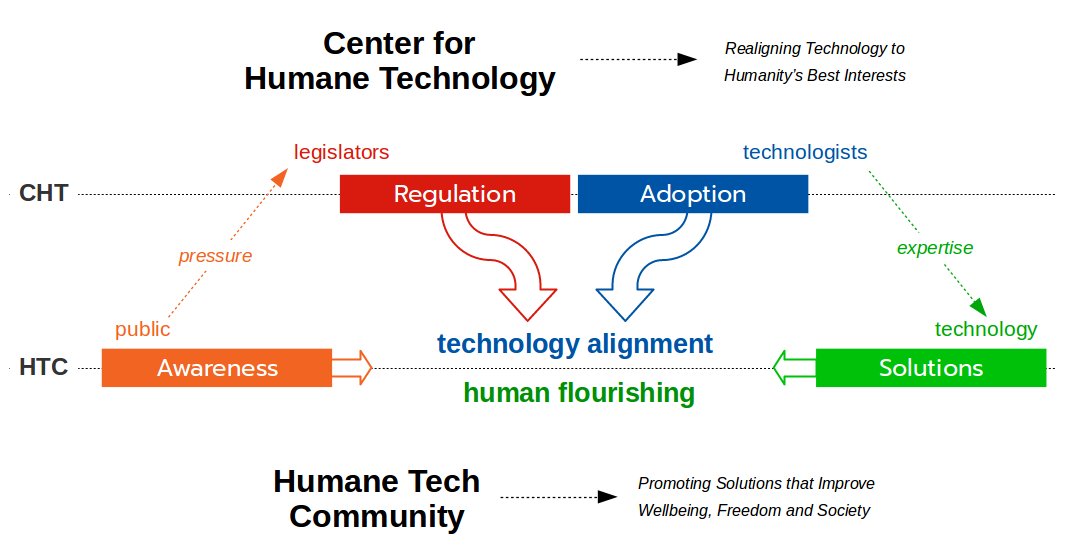
The community and Center do not necessarily align on all aspects, and community members may have different opinions on various topics (we are a grassroots organisation, after all), but we work towards the same goals. I’ll repeat the diagram that depicts our cooperation below:

Be sure to also read CHT’s @davidgljay’s statement on our positioning:
Of course! We must keep a sort of similar look to show that we are related, but adding something a little spicy, if you will, will keep people from getting confused. For example, adding the pyramid colors in some way.